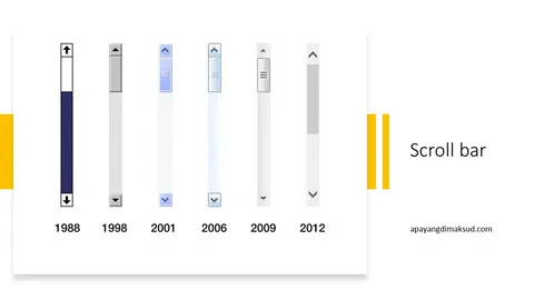
The Importance of Scroll Bars for Websites

The Importance of Scroll Bars for Websites
Considering how important scroll bars are for adequate site navigation, it is amazing how often they are overlooked! For potential clients or customers to be able to navigate through your information, scrolling has to be top of the priority list.
If you Have Scrolling, Will Anyone Use It?
You may have heard some people state how much they hate scrolling, but the users who are more than happy with the concept never complain. More users Article scroll on each page they visit, and to them it is just second nature. Younger web surfers with shorter attention spans and older users who have difficulty with coordination
Are commonly the ones who dislike scrolling. Sometimes those who are new to using computers and the internet may complain for a while, but they soon forget about it as they realize how simple it is with practice. The best recommendation would be to set your web site layout out in such a way that people can either choose to scroll for further info or have basic usability without scrolling at all.
The Revolution of the Mouse Wheel
More people like to scroll as the internet becomes part of their daily lives, and the mouse wheel has played a big part in the shift. Where scrolling once required users to adjust the pointer onto the small arrow and click hundreds of times, they now only need to flick a wheel in the middle of the mouse to move through a page or more at a time. This means more web site visitors are willing to scroll through any number of pages, but you should still consider the small number who won’t scroll at all when creating your site design.
Eliminating Scrolling Entirely is a Bad Idea
The best strategy is to have all the important and necessary links and information in clear view and available to everyone without having to scroll, regardless of their monitor size or resolution. To be sensitive to all users, take the worst case scenario into account and you will never disappoint anyone. An example could be on pages with large articles: The majority of people who want to scroll can do so with ease, and for others you have links to each page of the article, and at the bottom of each page, links to go back to the top again. The idea is to not make anything inaccessible to people who don’t want to scroll.
Never Have Left to Right Scrolling on Your Site!
There really is nothing worse than wanting to view web pages who have left to right scrolling! If you can’t understand why that would be bad, take a moment to think about this: Every time a reader reaches the end of a sentence they need to scroll further right, then back to the left and then further right… and so on and so forth! It is a very frustrating experience, especially when the content seems good but is so painful to get through.
Don’t Use Flash For Scroll Bars
Never think you can do better Article Scroll bars using Flash, because they won’t be standard and will be difficult for all users. Of course some of them look cool but visitors are more often repelled by them than not.
If their mouse wheel won’t scroll through, which is also common, they will give up and exit the site. Whether the standard scroll bar matches your sites color schemes is not the point, and users will appreciate the fact that they can find it straight away if scrolling or use their mouse wheel if they prefer. If someone views your website to find they need to spend extra time learning to navigate around, they will choose to exit and find another one that is set up how they expect it to be, with standard scroll bars.


