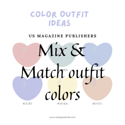
Creating a stylish and well-coordinated outfit involves more than just picking out your favourite pieces from the wardrobe. Understanding how to mix and match colors is a key skill that can elevate your fashion game. Whether you’re a fashion enthusiast or someone looking to enhance your everyday style, mastering the art of color coordination is a game-changer. Let’s delve into some tips and tricks to help you effortlessly blend colors for a harmonious and eye-catching look.
Understanding the Color Wheel
The color wheel is a fundamental tool that can guide your color choices. It consists of primary colors (red, blue, yellow), secondary colors (green, orange, purple), and tertiary colors. Complementary colors, located opposite each other on the wheel, create a high contrast and vibrant look when paired together. Analogous colors, found next to each other, offer a more subtle and harmonious combination.
Neutral Foundations
Neutrals provide a timeless and sophisticated base, offering a clean slate for experimenting with different color combinations. Whether you’re aiming for a bold statement or a subtle elegance, neutrals lay the groundwork for a wardrobe that seamlessly transitions across various styles and occasions.
Also read: Things Keep in Mind When Buying a Hair Spray
Monochromatic Magic
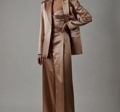
Monochromatic palette not only exudes timeless elegance but also simplifies the outfit-building process. By selecting varying shades within the same color family, you effortlessly achieve a polished and cohesive look. This approach grants you the freedom to experiment with diverse textures and patterns, adding depth and interest to your ensemble while maintaining an overall sense of sophistication.
Contrast with Complementary Colors
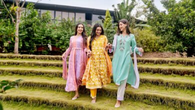
If you’re feeling bold, experiment with complementary colors. Pairing opposite hues on the color wheel creates a dynamic and visually striking combination. For example, pair a deep blue with a vibrant orange or a rich red with a cool green.
Fashion magazines often showcase the latest trends and innovative color combinations. Drawing inspiration from these sources can provide valuable insights into how designers play with complementary colors to create runway-ready looks. Incorporating elements from the fashion world can add a touch of avant-garde flair to your personal style, allowing you to stay ahead of the curve and express your creativity through clothing. So, the next time you flip through the pages of a fashion magazine, keep an eye out for color pairings that catch your attention, and don’t be afraid to bring a bit of runway magic into your everyday wardrobe. After all, fashion is about embracing the unexpected and making a statement that reflects your unique style.
Analogous Elegance
For a subdued and refined aesthetic, opt for analogous colors—those neighboring each other on the color wheel, like blues and greens or reds and purples. This choice results in a harmonious and pleasing visual composition, striking the perfect balance without overwhelming the senses. Embrace the subtle beauty of analogous hues for an effortlessly elegant appearance.
Texture and Pattern Play
Upgrade your outfit by playing with textures and patterns, infusing it with depth and visual intrigue. If you’ve chosen a solid color as your base, introduce a textured garment or a patterned accessory to create striking visual contrast. This simple yet effective technique adds dynamism to your ensemble, ensuring that every element contributes to a well-balanced and eye-catching overall look.
Also read: How to start a Fashion Magazine
Accessorize Strategically
Power of accessories in your color coordination arsenal. A bold-hued statement accessory can serve as the focal point, injecting life into a neutral ensemble. On the flip side, opting for subtle accessories in complementary or analogous tones acts as the cohesive thread, seamlessly tying together the various elements of your outfit. Let your accessories speak the language of color, elevating your style with precision and flair.
Consider the Occasion
Take the occasion into account when choosing your color palette. Vibrant and bold colors might be perfect for a casual day out, while a more subdued palette may be suitable for a formal event.

